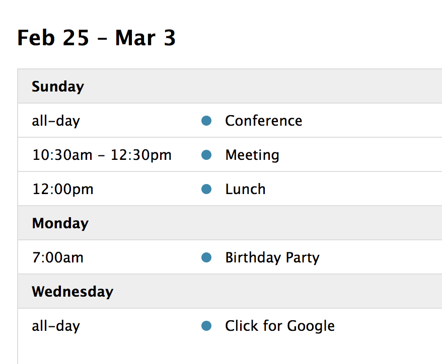
Docs List View
A list view displays events in a simple vertical list for a specific interval of time. If there are no events during a specific interval of time, the “No events to display” screen is displayed, which can be customized via render hooks. There are 4 preset list views: listDay, listWeek, listMonth, and listYear. They can be initialized in an ES6 setup like so:
import { Calendar } from 'fullcalendar';
import listPlugin from 'fullcalendar/list';
...
let calendar = new Calendar(calendarEl, {
  plugins: [ listPlugin ],
  initialView: 'listWeek'
});
...
Or you can choose to initialized the List views as a global bundle:
<script src='<fullcalendar-dist>/all.global.js'></script>
<script src='<fullcalendar-dist>/themes/monarch/global.js'></script>
<link href='<fullcalendar-dist>/skeleton.css' rel='stylesheet' />
<link href='<fullcalendar-dist>/themes/monarch/theme.css' rel='stylesheet' />
<link href='<fullcalendar-dist>/themes/monarch/palettes/purple.css' rel='stylesheet' />
<script>
...
var calendar = new FullCalendar.Calendar(calendarEl, {
  initialView: 'listWeek'
});
...
</script>
If you’d like a different interval of time, you can create a custom view with type 'list'.
The following settings are specific to list-view. However, many other settings throughout the API also affect list-view as well, such as in the event render hooks and eventClick.
Event Appearance
The event appearance can be controlled by List Item Event Render Hooks.
In the following example, we pass non-standard information about events through the extendedProps hash property. Then, we change the display of the event row and dot marker depending on a custom status property:
var calendar = new FullCalendar.Calendar(calendarEl, {
  initialView: 'listWeek',
  events: [
    {
      title: 'Meeting',
      start: '2019-08-12T14:30:00',
      extendedProps: {
        status: 'done'
      }
    },
    {
      title: 'Birthday Party',
      start: '2019-08-13T07:00:00',
      color: 'green'
    }
  ],
  listItemEventClass: (data) => (
    data.event.extendedProps.status === 'done'
      ? 'list-item-event-done'
      : ''
  ),
  listItemEventBeforeClass: (data) => (
    data.event.extendedProps.status === 'done'
      ? 'list-item-event-dot-done'
      : '',
  ),
});
/* CSS */
.list-item-event-done {
background-color: red;
}
.list-item-event-dot-done {
background-color: white;
}Toolbar Buttons
By default, the Toolbar will render buttons for list-view as the text “List”. To opt-out of this behavior, and render duration-based buttons like “Week” or “Month”, set listText: false.
Demo: